Accoson Medical Packaging
Print Design
Working with ACCOSON™, a distinguished UK medical brand renowned for their quality blood pressure monitors, was a unique opportunity for us. With over 165+ years of experience, ACCOSON™ has made its mark in the medical industry, but their previous packaging design has received minimal attention. When the company decided to expand its product line to include a new range of stethoscopes, we were approached to create packaging that appealing to a modern, younger audience.
The new stethoscope range was designed with medical students as the primary target market. Understanding this demographic was key to crafting a design that would resonate, students are often drawn to products that are not only functional but also visually appealing and contemporary. With this in mind, we opted for a vibrant, modern design approach.
The packaging was conceptualised to stand out in a competitive market. Using a palette of bright, engaging colours to immediately capture attention. These colours were chosen not only for their aesthetic appeal but also to convey energy, innovation, and approachability—qualities that would resonate with a younger audience.
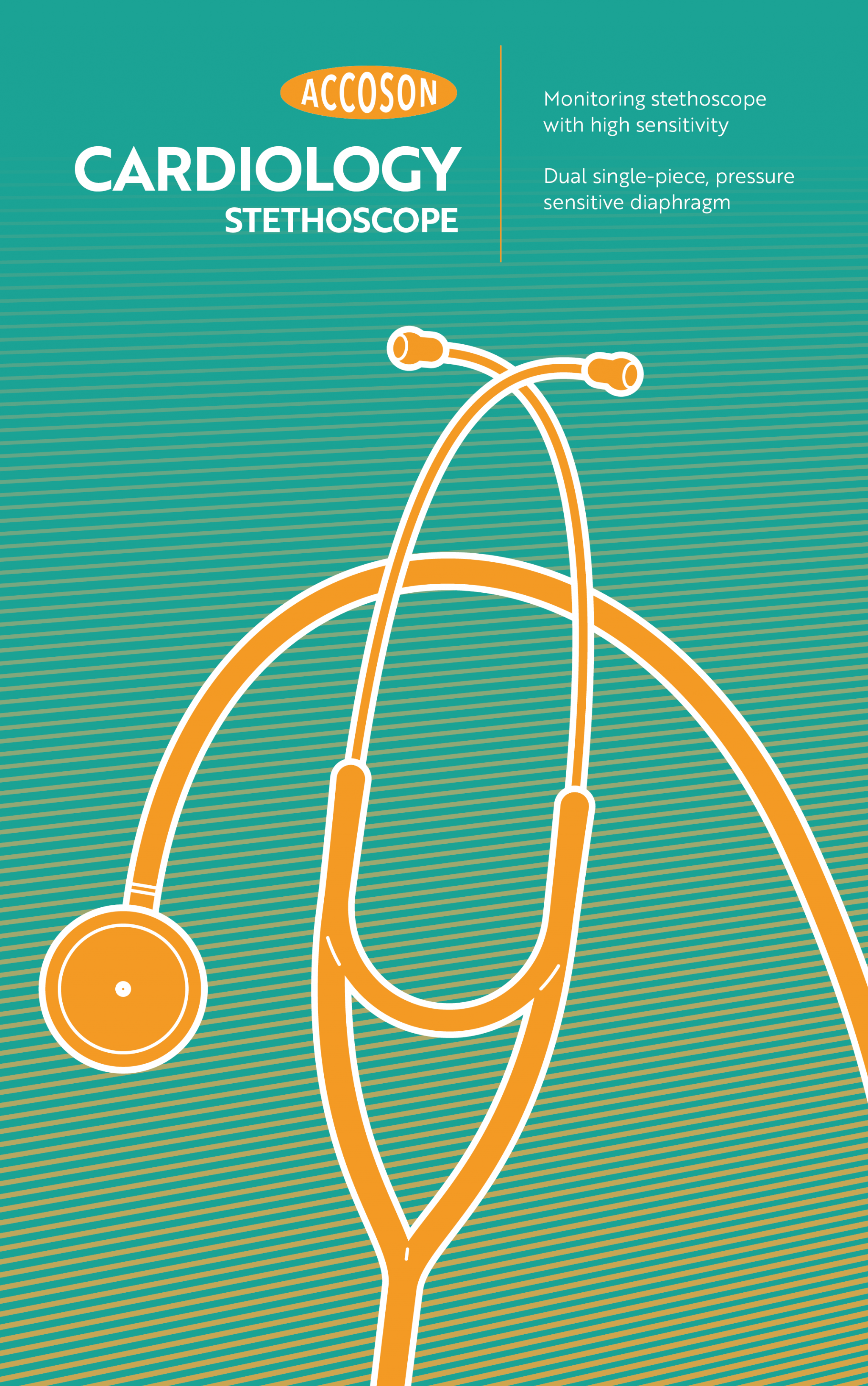
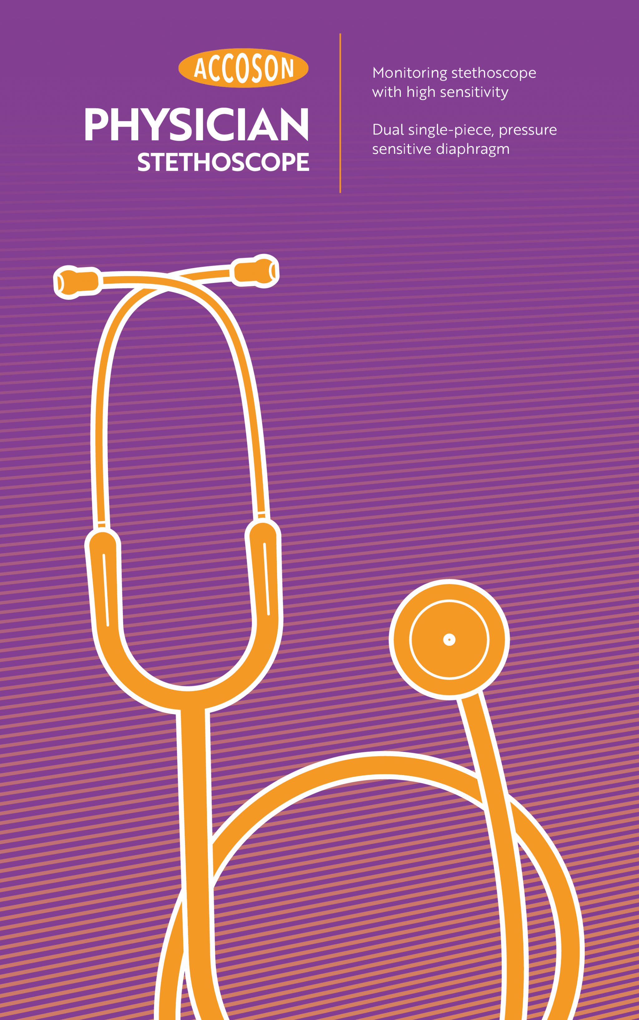
Also incorporating modern illustrations, highlighted the stethoscopes themselves. These visuals were designed to be both informative and appealing, showcasing the product in a way that was clear yet still artistic and unique. The illustrations served a dual purpose: they provided a glimpse of the product’s features and functionality, while also adding an element of design sophistication to the packaging.
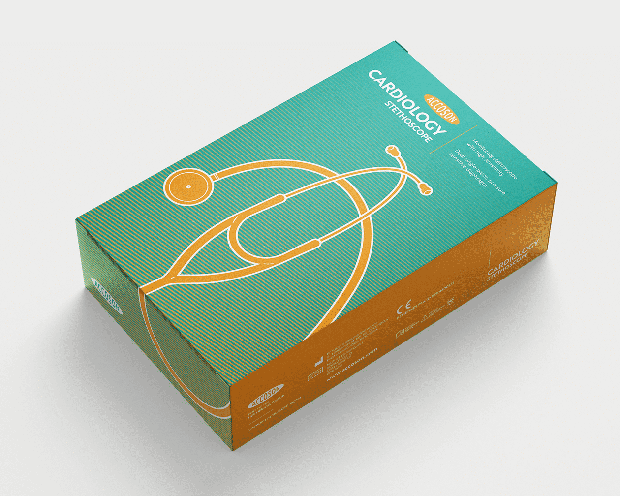


While the packaging needed to appeal to a modern market, it was equally important to respect ACCOSON’s rich heritage. The brand logo was given prominence to maintain recognition and reinforce the company’s reputation for quality. This was accompanied clear and professional typography to give an immediate description of the contents.
User-Centric Design
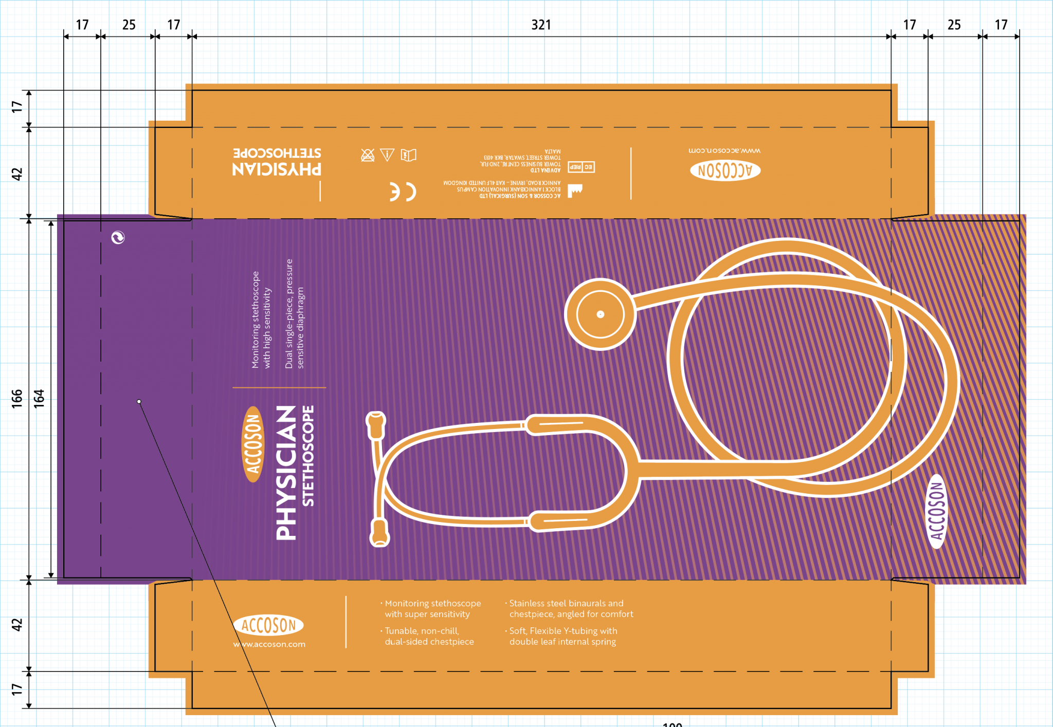
Another key consideration was practicality. The packaging was designed to be not only visually appealing but also user-friendly. Medical students, often on the go, need packaging that is easy to handle and provides quick access to the product. We ensured that the design was compact, durable, and informative, including key product details and usage instructions on the packaging in a clear and concise manner. Prototyping this printed material became a fun task!
The reimagined packaging for ACCOSON’s stethoscope range was a project that allowed a merge of creativity with strategic thinking. By focusing on bold visuals, modern appeal, and a nod to tradition, the design bridged the gap between ACCOSON’s past and its forward-looking aspirations. This project not only helped ACCOSON™ enhance their product’s marketability but also reinforced their position as a leader in the medical field.